

Who should you hire for a map project? Why a specialist map illustrator is often the best choice.
If you’ve started looking for someone to help you with your map project, you’ve probably already spent weeks, maybe even months, thinking about it and have a pretty good idea of what you want. You may be looking for an illustrator, or you may be looking for a cartographer. But you may also simply know you need a map without really knowing who’s the right person to make it.
Whatever the brief is (a very illustrated tourist map, a detailed hiking map, a magazine feature…), I’ve learnt that the projects that work best rarely fit into just a single discipline. You need illustration, you need graphic design, you need cartography, and most importantly you need to understand how people actually read and use a map.
Clients usually know what they want their visitors or readers to discover. What they haven’t always worked through is everything that has to happen before that idea becomes an actual map that works: what deserves to stand out, what can be simplified, how much detail is actually useful, etc. Those are what decide if a map simply looks good or if it really works.
In this article, you’ll discover:
- Why many custom maps need more than illustration or cartography alone
- How creativity, clarity and geographic accuracy work together
- Why specialization makes a difference throughout a map project
- What to consider when choosing between an illustrator, a cartographer, or a specialist map illustrator for your next map
1. Maps sit between several disciplines
One of the reasons I love making maps so much is that they mix several disciplines together. Even a project that starts as “just an illustrated map” quickly turns into something bigger than illustration alone.
That’s why I often find myself looking at the same project from different angles: as an illustrator, graphic designer and map specialist. I’m thinking about visual storytelling and how to make a place memorable, creating a style that fits the client and their audience while making sure information is clear and easy to find, and ensuring the geography actually makes sense and that the level of detail is the right one for the project.
All of this starts long before I open Illustrator and draw the first line.
The size of the map, the amount of content, who is going to read it, where it will be printed or shown, and what the project is trying to achieve, all of this changes how the map should be made. Maps for visitor guides, magazines, museum exhibitions or resorts all represent places, but they don’t communicate the same way, and they shouldn’t be approached the same way either.
Those first conversations are often what decides not only how the map will look, but most importantly how well it will actually work once it’s finished.
For example, the illustrated map I made for Le Minorange, Bouygues’ internal magazine, had to support an editorial layout and work alongside written content. The illustrated map of Paris I designed for the Arkansas Museum of Fine Arts had a completely different role: it was part of an exhibition experience and needed to add context without competing with the artworks around it despite its size covering-up an entire wall. The design decisions behind those two maps were completely different, even though they were both illustrated maps.
2. Finding the balance between clarity and creativity
Illustrated maps are often associated with beautiful artwork. And that’s totally understandable as illustration is what gives them personality and atmosphere, and what makes people want to look at them in the first place. But unlike a regular illustration, a map has another responsibility: it also has to help people understand the geography.
Making a good illustrated map isn’t only about making something beautiful. It also means deciding what needs to stay geographically accurate, what can be simplified, and how the illustrations can help the reader instead of overwhelming them. When I work on an illustrated map, I want to make sure the illustrations are part of how the map communicates and not only nice and fun elements added on top of it.
And I want to be clear that I’m not saying traditional illustrators only make beautiful artworks without thinking about the concept, it’s actually the opposite. Visual storytelling is one of their biggest strengths, and it’s exactly why they’re the right choice for so many creative projects. My own path has just led me to develop another layer on top of that: understanding how illustration, geography and information all work together. And part of my job is helping my clients find that balance, by recommending the right amount of illustration, detail and geographic accuracy for their project.
This is actually one of the reasons I use GIS data and other professional geographic sources instead of just tracing an online map. It gives me clean, accurate information that I can then use creatively. Instead of limiting my illustration process, it actually gives me more freedom to simplify, stylize and redesign the map while still keeping the geographic relationships that help readers understand the place.
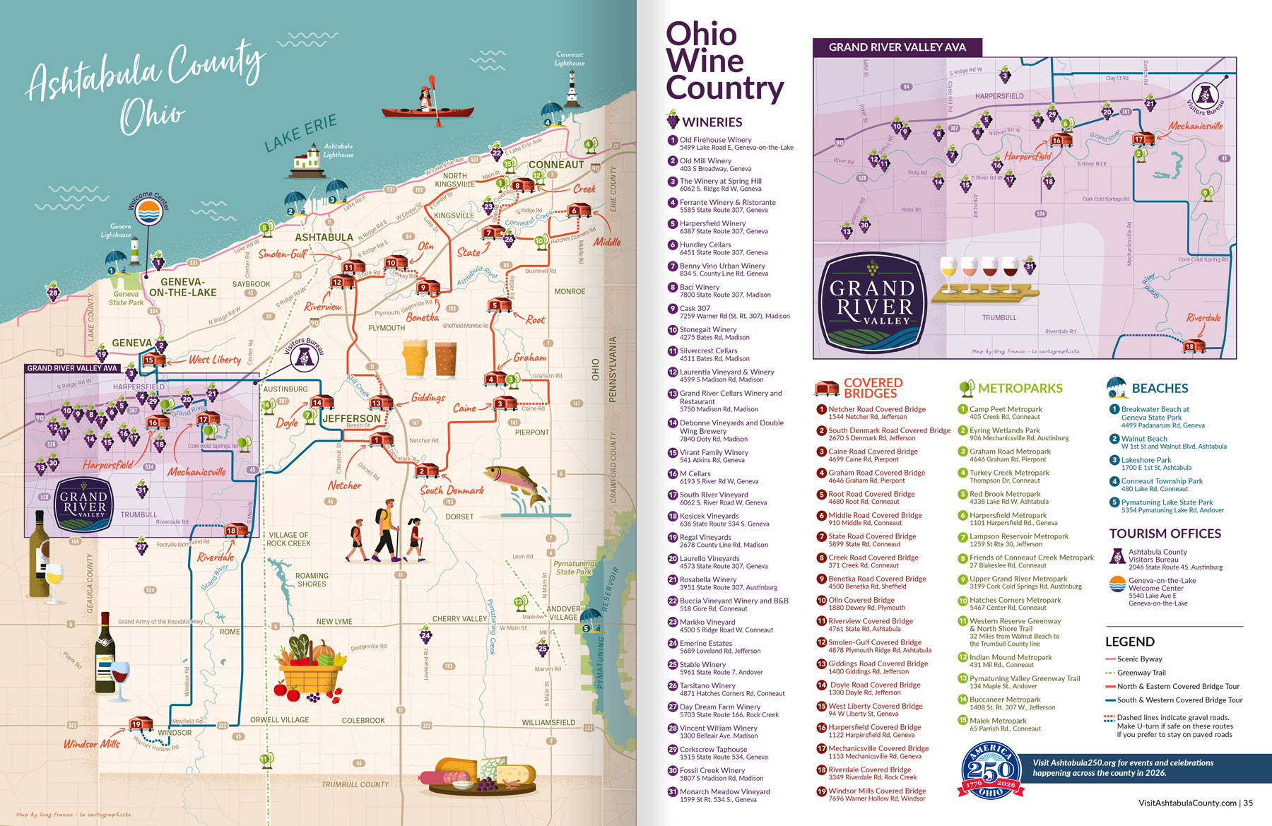
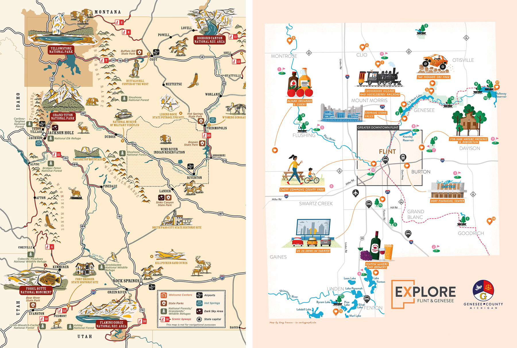
For example, the illustrated visitor maps I created for Travel Wyoming, Flint & Genesee County, or Ashtabula County are all highly illustrated tourism maps, but each one strikes a different balance between creativity and navigation, because each destination, audience and publication had different objectives.
3. Solving complexity
Dealing with complexity is probably where my approach is the most different. Illustrated maps need creativity without losing clarity, while practical maps (such as trail maps, site maps, visitor maps, road maps or reference maps) have the opposite problem: they need to stay accurate without becoming too much.
Cartographers are experts at representing geography accurately, and they often work with a lot of geographic data and very detailed information. This is exactly what’s needed for a lot of scientific, technical or analytical maps, but when the goal is to communicate with the general public, all that complexity usually needs to be interpreted, not just shown as it is.
This is where my role begins.
A city map may not need every street, a hiking map may not need every contour line and a resort map may not need every single building on the property. The difficult part is deciding what information really helps the reader. This is why I’m always trying to find ways to make things simpler without losing what matters.
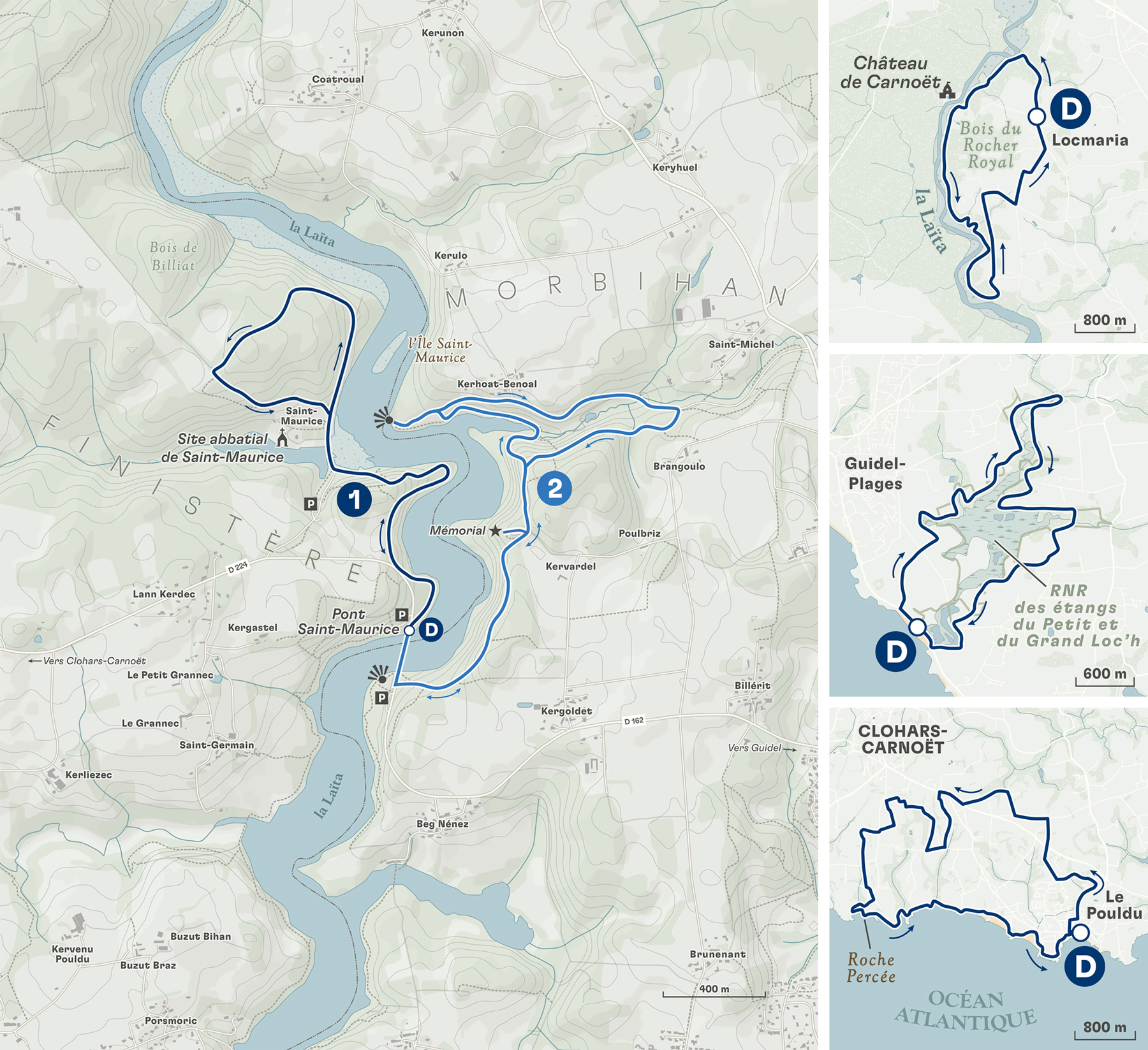
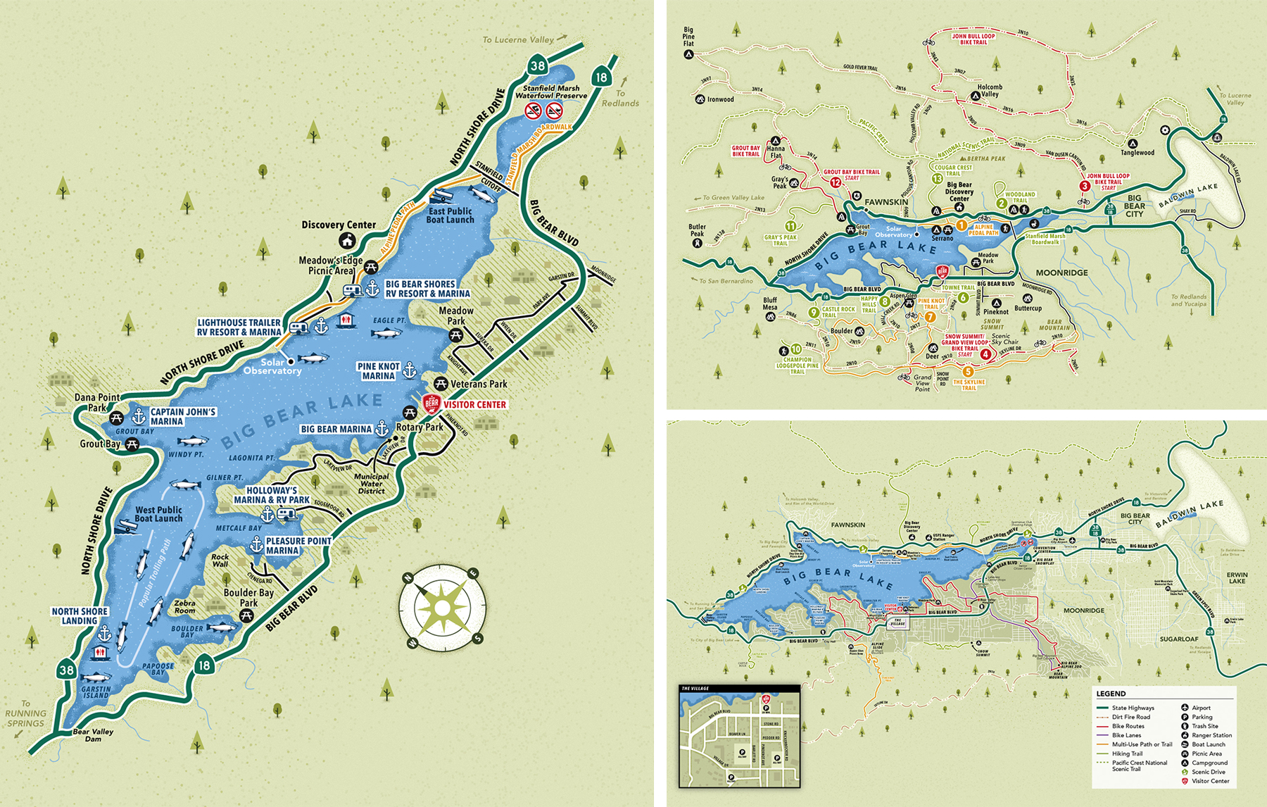
The topographic hiking maps I create for Terre Sauvage need to remain reliable enough for hikers to visualize their future adventure while fitting into the magazine’s editorial style. The French maritime areas map I designed for the Musée national de la Marine was a different kind of challenge altogether: transforming complex maritime zones and geographic data into something immediately understandable for museum visitors. And the Pink Shell Beach Resort & Marina map or the Hutton Brickyards site map have yet another objective: helping guests orient themselves quickly without overwhelming them with unnecessary detail.
One of the first things I look at is the relationship between how much content there is, how big the area is, and how big the final map will actually be. That’s often where opportunities begin to appear. Sometimes a simplified base map creates a clearer result. Other projects benefit from zoomed-in insets, numbered points of interest or a different balance between illustration and geographic accuracy. And sometimes the best solution is just to split the information across several maps instead of trying to fit everything in one.
None of these decisions follow a fixed formula. Every project deserves its own solution.
It’s also why I spend a lot of time asking questions before I start any design work, usually starting with a first conversation about the project’s size, audience and goals. My clients are the experts on their destination, their publication or their brand. They know the story they want to tell, the places that matter most and the experience they want readers to have. My job is to turn that knowledge into a map that’s clear and that people actually enjoy using.
It’s a collaborative process with my client rather than a production process and there’s a lot of discussion in order to make the right choices. Sometimes geographic accuracy isn’t even the most important thing! A slight adjustment to the layout, simplifying the road network, or giving more space to the important landmarks, can make the map much clearer without compromising its purpose.
Another thing to keep in mind is that practical maps don’t have to look purely functional and generic either. A lot of organisations still use screenshots from online mapping service, or a standard road map, because they think that’s just what a practical map has to look like. But a practical map can be designed just as carefully to match a publication, a brand or an exhibition as an illustrated one can. Colour palettes, typography, textures, custom iconography and thoughtful design all help a map feel like an integral part of the project rather than an asset added at the last minute.
4. Specialization over style
Many illustrators are known for their distinctive visual style and that’s usually what attracts clients to their work, and rightly so. Developing a recognisable style takes years of practice and refinement, and that’s an incredible achievement.
My own path has been a bit different. When most illustrators become known for a style, I chose to become known for a specialty, building my career around one area of expertise: maps.
This specialization has taught me a lot more than just how to draw them. It has taught me to identify what information matters the most, how to simplify complex content, how to adapt a map to its audience, and how to ask the right questions before a project even starts. It has also given me a kind of versatility that’s hard to develop when maps are only a small part of what you do.
Depending on the project, I might create hand-drawn illustrations, clean vector artwork, highly accurate practical maps, or much looser illustrated maps where atmosphere and storytelling come first. I’ve also designed maps for publishers, tourism destinations, museums, magazines, agencies and private clients too. The visual approach changes from project to project, but the underlying expertise remains the same.
That variety is something I genuinely enjoy. One week I might be drawing a map of the US for a NYT Best Seller book, the next designing a Napoleonic-inspired private estate map, then moving on to a visitor map for Napa Valley, a city map for Arlington, Texas or an illustrated map of Utah for a magazine feature. None of those projects look alike, but they all come from the same way of thinking: understanding the objective first, then choosing the visual approach that would best achieve it and matches the client’s identity.
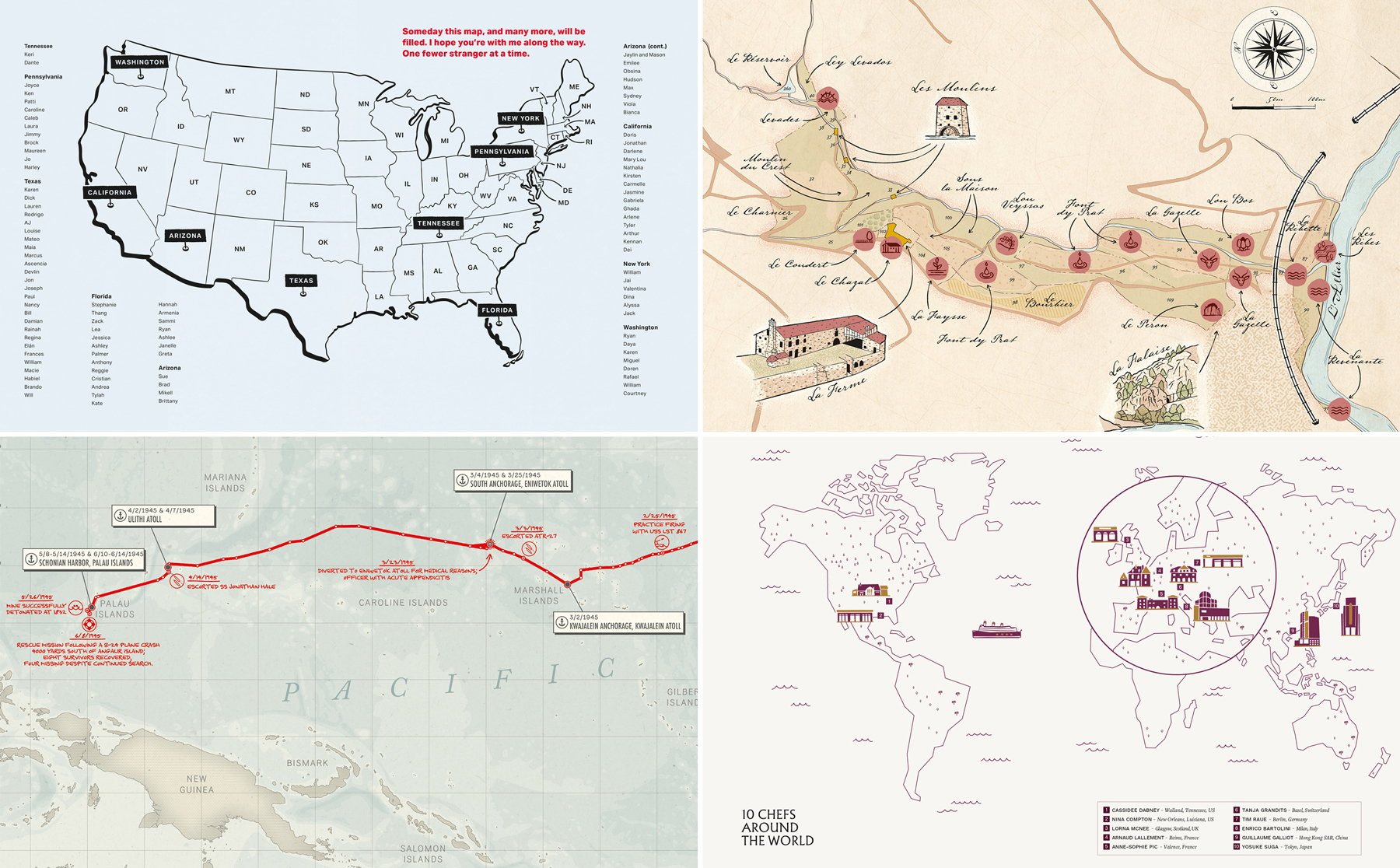
Working across all these different industries has also taught me something else: every client has different objectives, different audiences and different constraints. A tourism destination wants visitors to discover a place, so their maps need to balance storytelling with navigation. A magazine or a publisher wants a map that supports a story without taking attention away from it. A museum wants to improve the visitor experience while remaining intuitive. A brand wants a map that feels like a natural part of its identity. And I’m not even mentioning every different technical requirements that come with each project, from a large format map printed on a wall to a map turned into an interactive one on a website.
What all these projects have in common is that they all need adaptation, and working across so many different contexts has made purposeful adaptation one of my strongest skills.
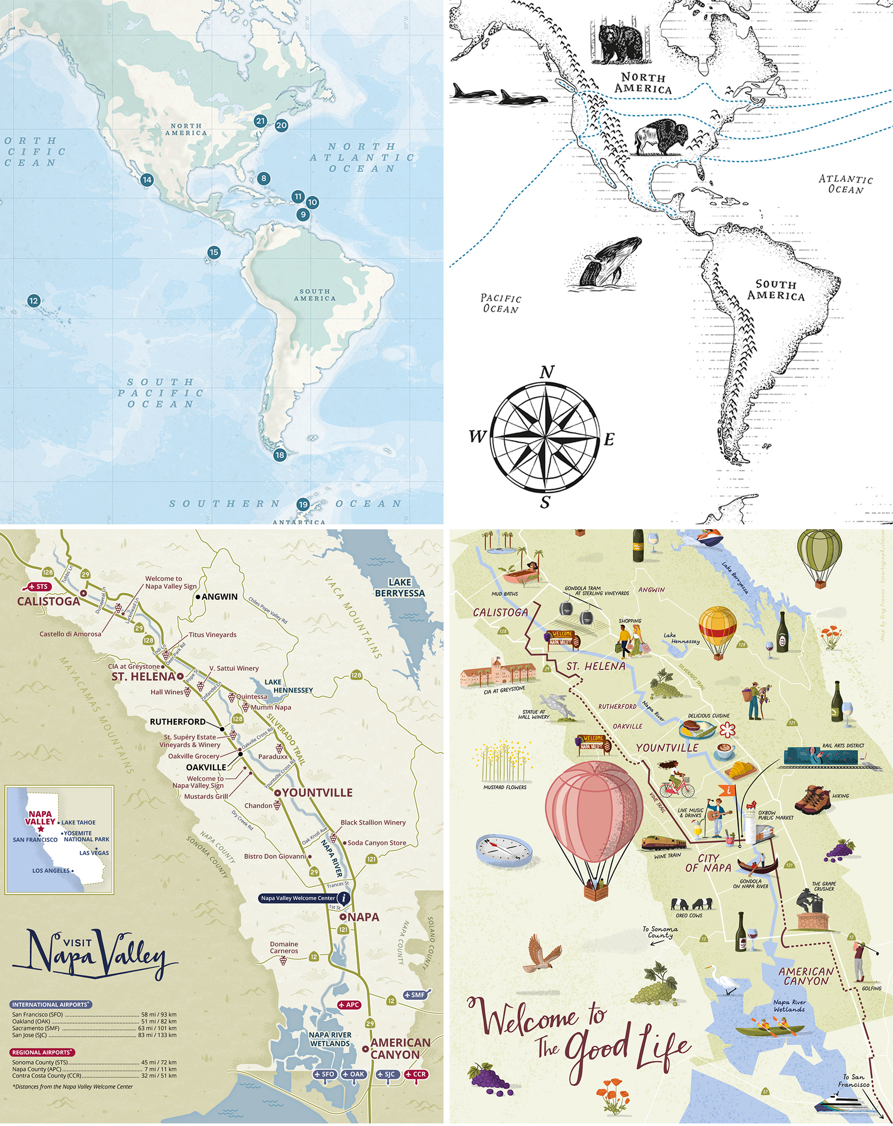
Bottom: Road map and illustrated map for Visit Napa Valley Visitors Guide.
Adaptation is key, even when working on different maps of a same area for a same client. I created the maps of the Americas for two different books published by Gestalten. Each book had a specific art direction and each map had a different purpose, hence the different style and approach. I also created both maps of Napa Valley for Visit Napa Valley. Both are featured in the same visitor magazine but they each have a different goal: one is used for orientation and to easily locate a selection of wineries, while the other is more about storytelling and all the things you can experience in the Napa Valley.
5. Conclusion
People sometimes wonder if they should hire an illustrator or a cartographer for their map project. The honest answer is that both are excellent professionals, each with their own expertise and that the right choice really depends on the type of map you’re trying to make.
If your project is purely artistic, working with an illustrator is probably the right call. If it requires very technical cartography, large datasets or scientific accuracy, then a cartographer is definitely the right person. But most custom maps actually sit somewhere between these two worlds.
They need geographic understanding, thoughtful design and visual storytelling to work together to create something that’s both useful and enjoyable for the people reading them.
As a specialist map illustrator, that’s the space I’ve chosen to dedicate my career to.
Over the past ten years, I’ve had the opportunity to create maps for such a wide variety of clients, from recognized publishers (like Simon & Schuster, Gestalten or Hachette group) and magazines (like Vanity Fair ), to toursim destinations (like Visit Boulder or Visit Big Bear Lake), along with creative agencies (like Miles Partnership), travel industry players (like Deutsche Bahn), public and cultural institutions (like The Presidio) and private clients. Every project has been different, but they’ve all reinforced the same lesson: the best maps are the ones where creativity and accuracy work hand in hand to achieve their purpose.
That’s ultimately what specialization has given me. The experience to understand each project’s needs, and recommend the approach that will produce the best possible map while adopting a style that will match my client’s requirements.
If you’re looking for someone to help you with your next map project, whether it’s a highly illustrated one, strictly practical one, or somewhere in between, take a look at my portfolio or just reach out! I’d be really happy to hear about it and discuss it with you.
I’m Greg Franco, also known as Le Cartographiste. I’m based in Brittany, France, and for the past ten years I’ve worked as a freelance illustrator specializing exclusively in custom maps for clients around the world.
If you’d like to learn more about me, visit my About page or explore my portfolio of: illustrated maps, practical maps or spot illustrations. You can also follow me on Instagram or subscribe to my newsletter for occasional updates.
Greg Franco | Le Cartographiste