

How to make an illustrated map step-by-step
A few years ago I decided to take part in the “Mapping Special Places” contest curated by They Draw and Travel and Stroly. I thought it would be interesting to share a step-by-step guide of how I created this illustrated map with you. In this post I’ll take you through my creative process and how it all came together. Many of the illustrated maps I create for tourism boards and destinations follow this same process (you can see examples at illustratedtouristmaps.com) so I hope that you can learn from this concrete example and design your own map.
1. Choosing a special place
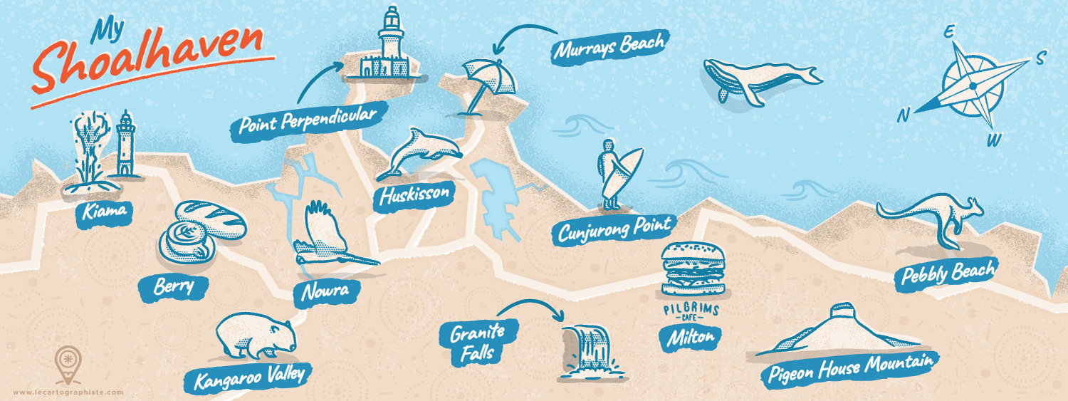
The first step is always to think about the location you’ll illustrate. It all depends of the project and who you’re designing the map for. If it’s for someone else, obviously they will pick the location for you. In my example, I was taking part in a contest where participants had to create a map of a special places to them. I chose to go with a map of the Shoalhaven area on the South Coast of New South Wales in Australia because it’s one of the most magical place in the world and that it has changed my life! I have met people there that have been so inspiring and I’ve experienced so many great things that it literally influenced the way I live today.
I’ve lived a nomadic life during 7 years, travelling across 4 continents and nowhere else in the world have I seen so many pristine beaches and native wildlife in such a small area. There are more than 100 beaches in less than 160km (100miles) of coast! And you get to meet kangaroos, wombats, cockatoos, dolphins, whales and many native animals almost on a daily basis! You thought that would be it but you can also see powerful blowholes, impressive waterfalls, visit significant cultural places, eat at great vegetarian cafes, hike in the bush, surf… I wanted my map to show everyone how wonderful this place is.
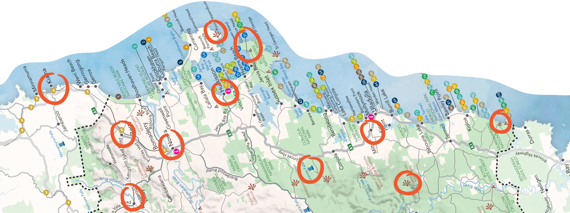
When you make an illustrated map it’s always useful to base it on an accurate representation of the area, like a Google maps screenshot. That way you’re sure you’ll stick to the natural geography of the place, even if you play with scales later on. In my case I used a map of the region created by Shoalhaven Tourism on which I selected the places I wanted to highlight. I now had the reference to draw my map over. I only had one last thing to do before getting creative: tilt the entire map. The contest required a panoramic landscape format but the Shoalhaven is a rather vertical region, the coast goes in a North to South direction. To make it understandable that the map was tilted I decided I would use a compass to indicate where the North is.
2. Selecting the colors and creating the map background
The second step is when you actually start making your map. You can use whatever software you’re comfortable with. I use Adobe Illustrator as I’m working on my computer and have been using this software for ages. I usually start by selecting the color palette I’ll be using and start styling the map. In my example I wanted a color palette that’s a reminder of the actual colors you get to see in the area. I’ve never seen so many shades of blue and incredible beaches than on the South Coast, especially in Jervis Bay. So I chose a simple and bright palette with a light beige tint for the map background and a bright blue tint for the illustrations.
After selecting my colors I usually start by drawing the coastline. I didn’t want my coastline to be 100% accurate so I used only straight lines and no curves to give it a special style. I then added the main inland bodies of water and the main roads. This gives some orientation and help the reader of the map get the idea of how all the different places are connected. To give the map a vintage feel I made as if it had been printed with the different color layers offset.
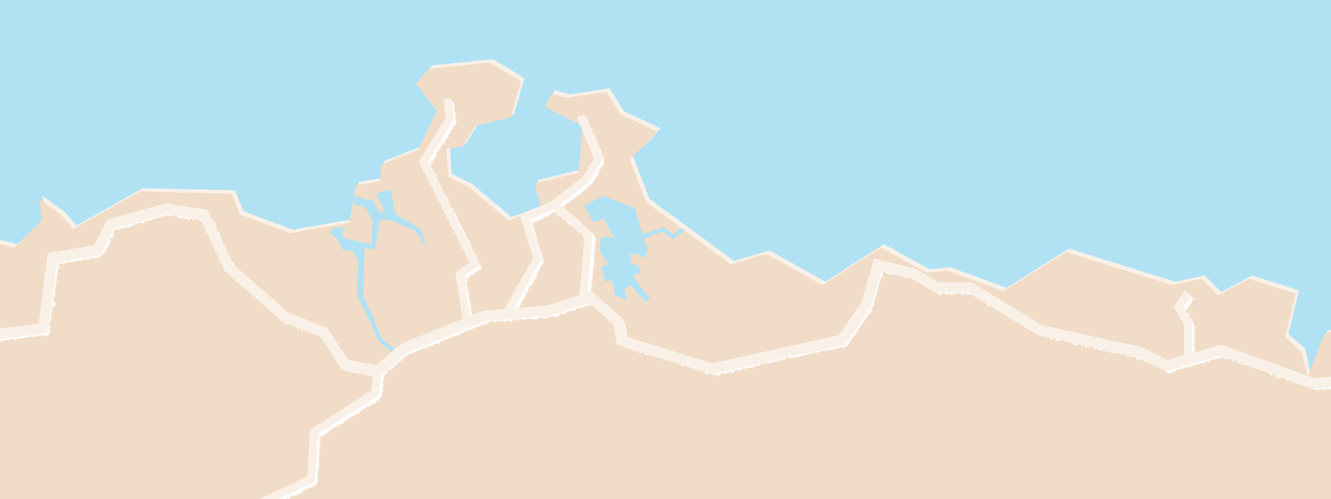
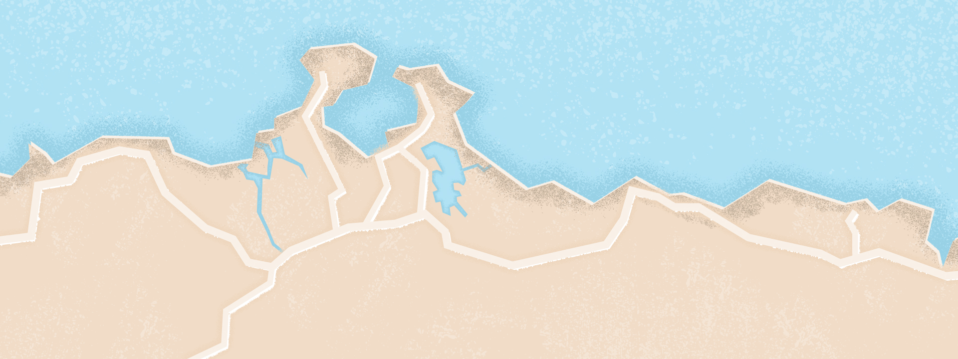
As you can see this base looked kinda too “flat” and bland. So I added textures using different brushes to bring depth and life to that part of the map. I didn’t want it to be too strong though as this is the background and I don’t want people to focus on it too much.
Making an illustrated map isn’t only about showing points of interests creatively. I like to add meaning and hidden messages sometimes to my maps. Back to our example, one important thing to me was to to acknowledge and value Aboriginal people and their long, rich cultural and spiritual connections to the Shoalhaven area on this map. So I created a pattern inspired by Aboriginal art that I applied to the land part of the map. Once again I wanted it to be subtle so that my illustrations would stand out. That’s why I used a color a little darker than the one used for the land.

3. Creating the illustrations
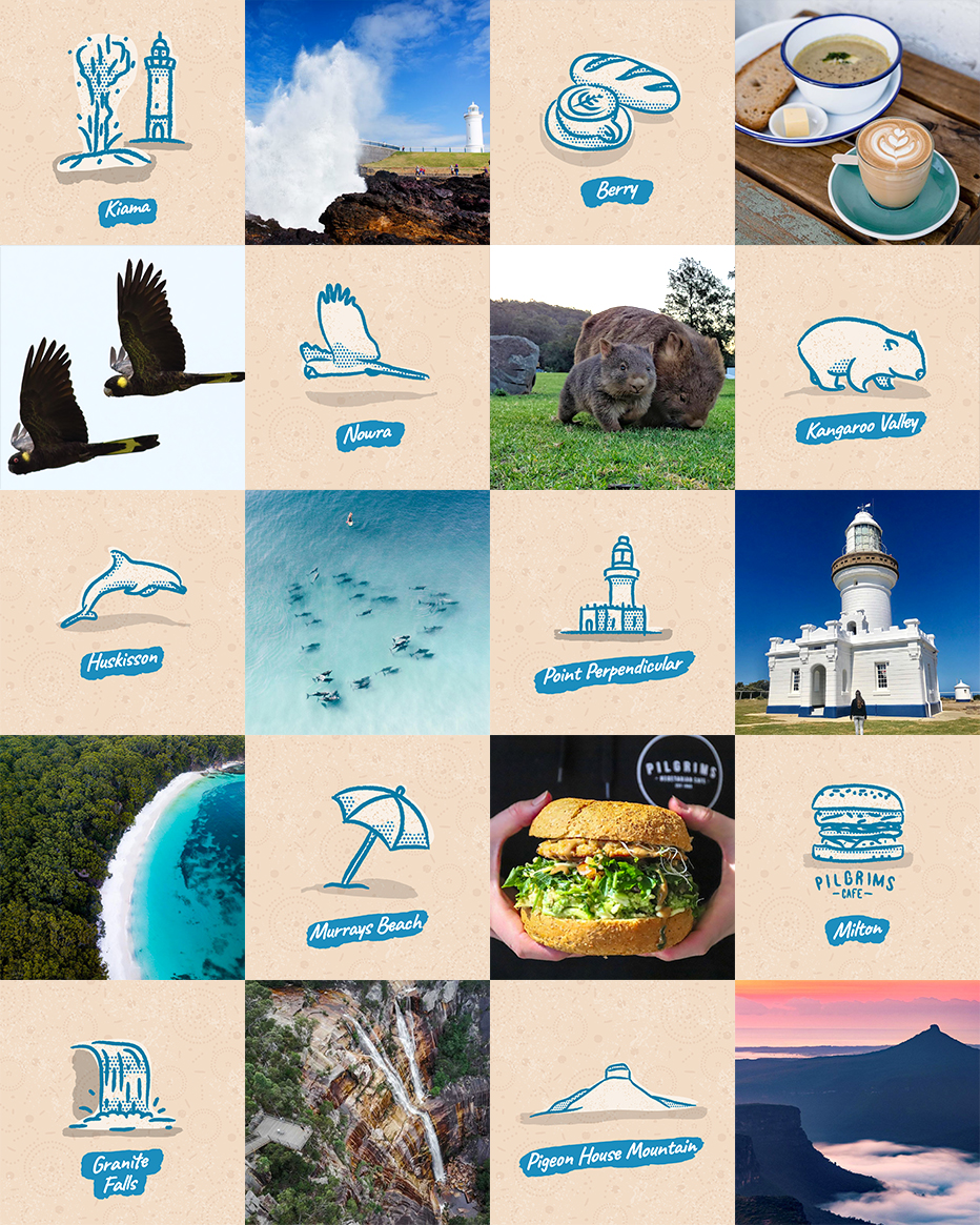
Now that that the background is ready you can focus on creating the different illustrations. I usually start by searching for reference material to base my illustrations on. Being familiar with the place you’re mapping can help a lot as you may already know what you want to draw. Once all the elements are collected I start to design one illustration to define the general style.
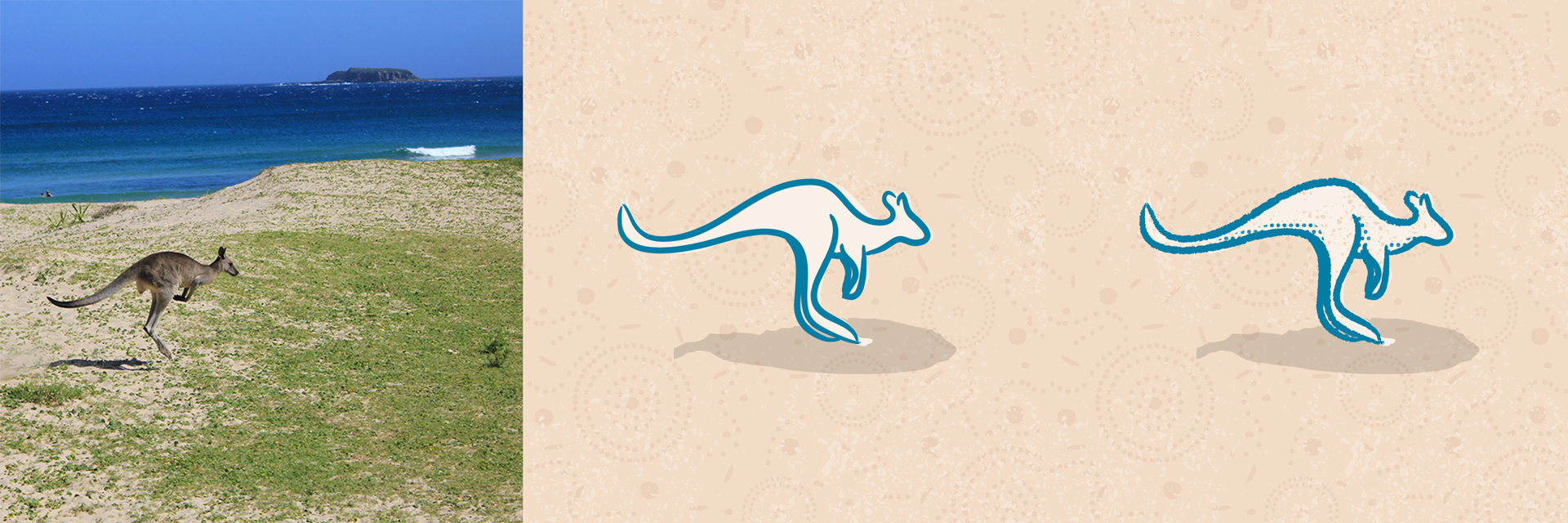
In order to get the hand-drawn style I initially wanted I used a brush by Retrosupply Co and decided to go with a very simple and minimal style. After that first outline I thought the lines were too clean so I applied a filter to make them rougher. I also used an “ink splash” texture to make it a bit dirtier. Finally, I added shadows as halftones to bring a bit more depth. It was also consistent with the vintage printed map feel I wanted.
Once the style is defined you can move forward and create the remaining illustrations. If you’re not hand-writing your texts, this is a good time to pick a font for your map too. You have to choose one that fits the general style but that’s clear enough to read. I used the font Caveat by Pablo Impallari as it had all the letters, 2 different styles if I wanted to use bold text and most importantly was really clear to read and had that “hand-written” style I wanted for my map. I also used a brush stroke behind my texts to make the names of the different locations pop-out.
4. Adding the illustrations to the map
The last step to make your illustrated map is to add the illustrations to the background you initially created. You have to make sure they’re all spaced correctly and not too clustered. You also have to make sure you meet any specific requirements. In this example I had to leave a margin in the middle of the map for printing purposes. Once your illustrations are on your map you can add a title if necessary.
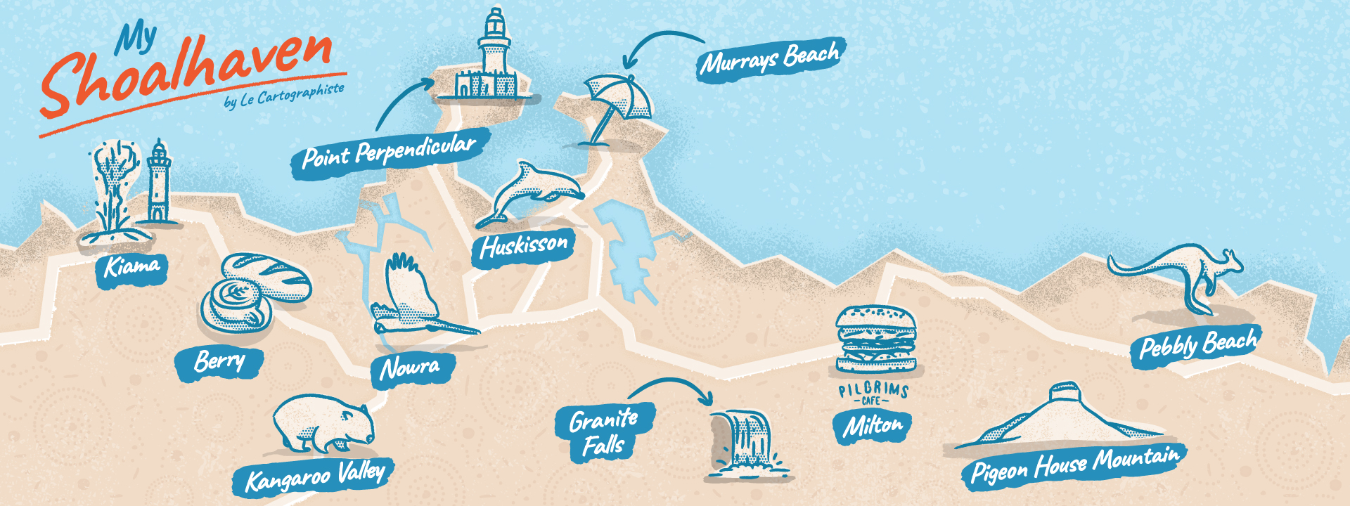
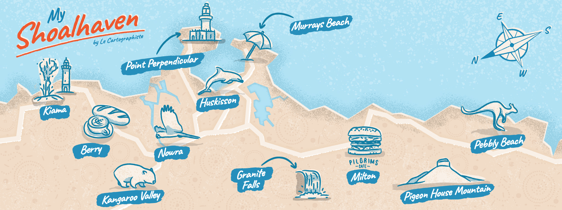
Now that you have all your elements on your map, it’s time for fine-tuning. As you can see on the image above, my map was having too much empty space on the top right corner. The title was also too flat in my opinion. So I added the offset effect to the title and created the compass to indicate where the North actually is.
You have to give you a bit of flexibility when you create your illustrated map. Sometimes you may need to add or remove elements when doing the final composition. I found that there was too much empty space on the coast between Murrays Beach and Milton and in the ocean. So I decided to add a new place to the map and create 2 new illustrations. Those were not only added to fill the space though. I wasn’t sure if I would have enough room to add them when I started this project. I also didn’t want to make too many illustrations and have to remove some. So I preferred adding some if there weren’t enough. I chose to add two key components to the Shoalhaven area: surf and whales!
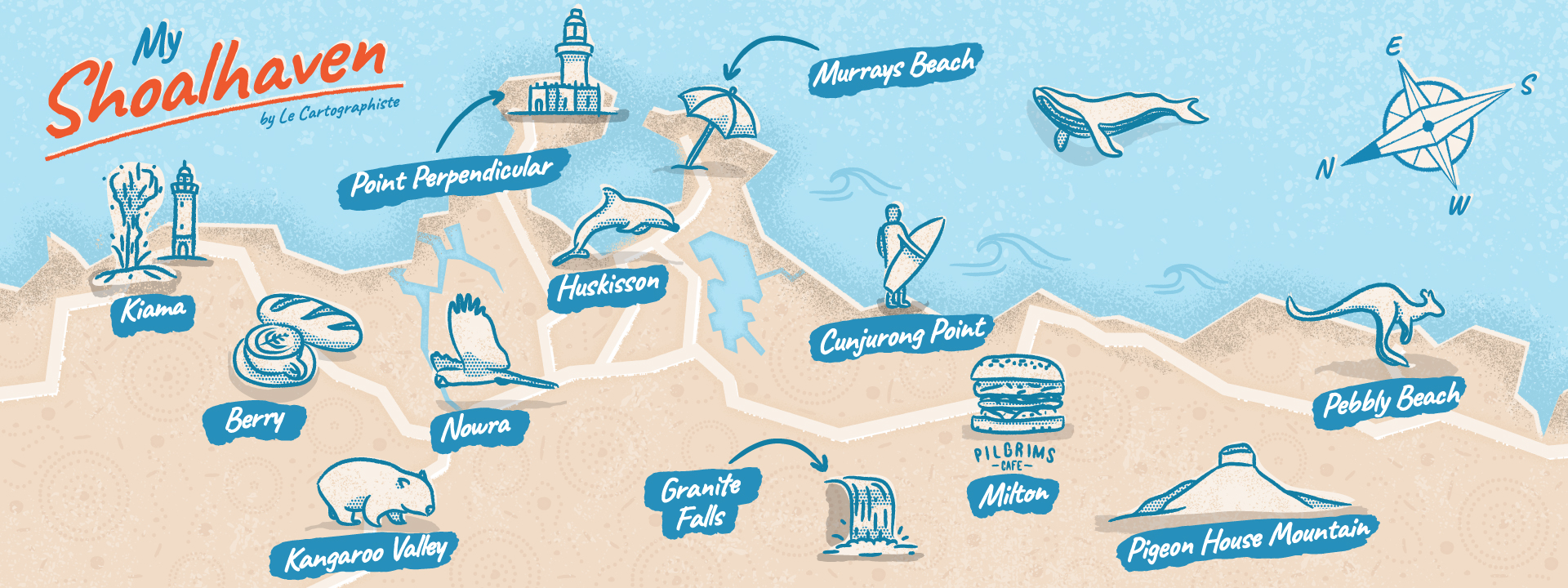
My map was almost final. The only thing missing at this point was my signature. This is why I chose to leave that space on the bottom left corner. I added my logo and my URL but once again in a subtle so that the focus is on the different illustrations.
5. Conclusion
Although I wasn’t selected as part of the 4 winners of this contest (congrats to the winners, the level was CRAZY!) I’m really happy with this map and what it represents to me. And I’m also grateful for the feedback I got, especially from Nate, co-founder of They Draw and Travel when he shared the map on Instagram:
“This map sent me down a 20-minute internet sinkhole looking at pictures of this piece of Aussie paradise. […] I’m totally moving here! Thanks Greg for sharing this awesome map with us!”
– NATE PADAVICK, Co-Founder of They Draw and Travel
I hope you liked this “behind the scene” post and that it helped you learn how to make an illustrated map from scratch. And make sure to check my article “What is an illustrated map” to learn about the difference between an illustrated and a practical map.
If you have any questions or if you want to know more about me you can always check my About page and discover more of my work: illustrated maps, practical maps or spot illustrations. You can also check my Instagram or subscribe to my newsletter.
Greg Franco | Le Cartographiste
Photo credit for the reference images in display order from left to right and top to bottom: Destination Kiama, Milkwood Bakery and Cafe, Wikipedia/Snowmanradio, Les Koalas en voyage, Ben Mackay, LaMochiFamily, Ben Hackett, Pilgrims Cafe, Shoalhaven Tourism, Sam Walklate.